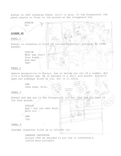
That's what my script pages look like. (Click on it for a closer look.) I thumbnail directly onto the script wherever there's space, and when I'm faced with the space I have to work with, that's when I hack my script into shape. There are hardly any Celadore pages that read exactly like the script (sorry, Kwanza) because as I go through and draw the thing, new situations, plot holes (or rather, vague plot details) always become apparent to me.
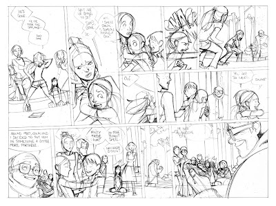
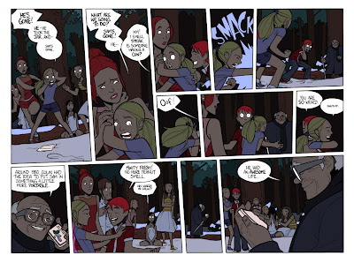
I decided to show the process for screen 165 because it's vastly different from script to final. Just look at the two thumbnails against the final page. The Altoids panel is in the top right corner in the thumb, and in the bottom left on the final. And everything else in between is completely different.
Most of that comes from the old cliché of characters writing themselves. Sam, Evelyn and Cel, and all the rest, occupy a massive part of my head where they're constantly jockeying for space and telling me how to do my job. With Sam disappearing into 1950, Evelyn was suddenly faced with her true feelings for Sam, and of course, he's got to be punched for doing so. None of that was in the script, but it was so natural, I had to do it.
Anyway, once I get a vague direction, and before it's been too long that I forget what all the crazy instructions to myself mean, the pencils get done...

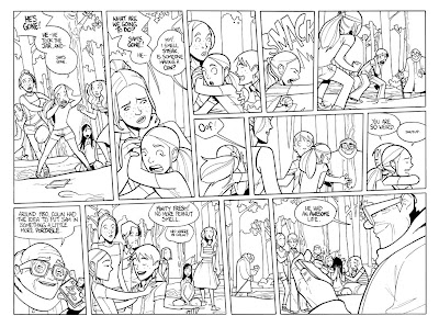
Then the inks... (I always ink the dialogue before anything else)

And then, I got that
awesome filter plug-in for photoshop that fills in all your shapes for you. It works for me because my art has a lot of closed 'fields' that makes it easier for the plug-in to figure out where the edges are. Once I got the plug in (which I got when I started doing chapter 2), my process went a little like this...
1. Double click the background to turn it into a layer.
2. Duplicate the layer, then select 'multiply' for the new layer from the drop down menu.
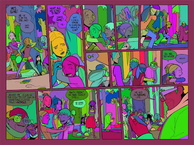
3. Go back to the original layer, and run the filters. First the multifill. Then the flatten. And you end up with something that looks like this. I know. Crazy, huh?

The benefit of this filter is that you can change everything without worrying about the ink layer that just sits on top. No more accidentally colouring your linework, which means less cmd-Z! ;o)
Then I go through with the paint bucket to fill in all the fields with their actual colours. Sometimes I have to use the pencil tool, mainly to fill in eyes, etc, where my black lines didn't close their 'field', but mostly it's bucket tool time.

This page was easy, because I just sampled colours from the previous pages set at night. I sampled all the dark colours, so I only had to go through and colour in the highlights. I just select each colour field with the wand, and do each area one at a time.
You'll notice for the snow I used a bright blue. The reason being if I had've filled it in as white, when I went through and selected all the white, I would have got the borders and speech bubbles too, so it's better to isolate them with weird colours, and change them later.
Anyway, to see the final screen, after the pencil work, and the gradients, etc. it's at
Zuda, of course!


